Print-ready Upscaling
How to make a low-quality old funeral photo printable?
TL;DR
- Start with the best source available, ideally a fresh 600 DPI scan saved as an untouched master before any edits.
- Clean up tone, dust, and obvious damage before you upscale so the print does not enlarge flaws along with the face.
- If you test
PhotoSharpener, keep it to one conservative pass and choose the version that preserves identity instead of the sharpest-looking preview.- Match the final print size to the actual pixel count, then do one paper proof because funeral programs and display prints are less forgiving than a screen.
If the only photo you can use for a funeral is old, small, or visibly soft, the goal is not to turn it into a perfect studio portrait. The goal is to make it clear enough to print with dignity, keep the person recognizable, and avoid the crunchy, overprocessed look that often happens when people rush straight to heavy sharpening.
The best results usually come from a calm workflow. Start with the strongest digital copy you can make, separate blur from low resolution and physical damage, restore the file in light passes, and then choose a print size that matches the pixels you actually have. That approach is slower than pushing one button, but it gives you a much better chance of ending up with a memorial photo that feels natural on paper.
Start with a realistic goal for the photo
Printable does not mean perfect
An old funeral photo becomes printable when the face reads clearly at the size you need, not when every pore and eyelash is magically rebuilt. Mild blur, faded contrast, scanner softness, and small dimensions can often improve a lot. Severe motion blur, missing detail, or a tiny face buried inside a group shot usually cannot become flawless, even with strong AI tools.
That matters because funeral printing is emotional. When people see the photo at the service, they care more about likeness and warmth than technical perfection. A smaller but believable print is usually better than a large print full of invented detail.
Protect the person's likeness first
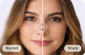
This is where many restorations go wrong. A tool can make a face look sharper while also making it look less like the real person. Eyes get overdefined, skin turns waxy, and the expression starts to feel generic.
A good rule is simple: if the image looks cleaner but family members would hesitate and say "that doesn't quite look like them," back off. Funeral photos should feel respectful and familiar, not cosmetically enhanced.
Build the best digital source you can
Scan the original at a resolution that gives you room to work
If you still have the physical print, scanning is almost always better than photographing it with a phone. The Library of Congress notes in its basic scanning guidance that snapshot prints often do well at a few hundred DPI, while higher capture settings help when you may need to crop, repair, or enlarge later. In practical terms, 600 DPI is a strong starting point for most small prints, and 1200 DPI is worth considering for wallet-size photos or visibly damaged originals.
Clean the scanner glass, disable auto-enhancement, and save a master as TIFF or PNG if possible. The Library of Congress also recommends careful handling for fragile originals in its scanning care guidance, which matters when the print is brittle, curled, or cracking at the edges. Keep that untouched master file separate from your working copy so you can always restart if an edit goes too far.
If you only have a phone shot, chat image, or memorial handout
Sometimes the print is gone and the only source is a photo someone texted years ago, a picture of the picture, or a file pulled from an old program. In that case, your first improvement may come from finding a better source before you edit anything. Ask relatives for the original scan, the camera-roll version, or a fresh phone capture made in bright indirect light with the camera parallel to the print.
Avoid screenshots, social-media downloads, and images copied out of messaging apps when you have any alternative. Compression throws away the fine transitions that restoration tools need. If the current file is the only one available, keep your print ambitions modest and plan around a smaller final size.
Diagnose what is actually making the photo look bad
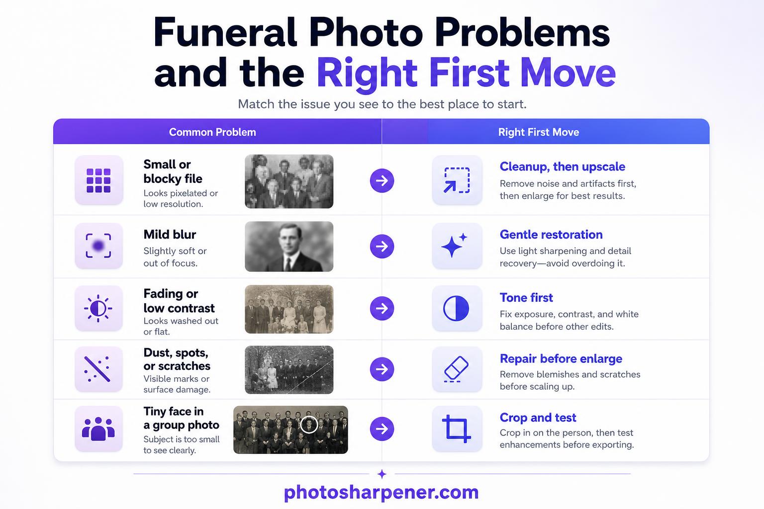
Low resolution, blur, and damage need different fixes
Many people treat every weak funeral photo as one generic "enhance it" problem. That is usually what creates bad results. A tiny file needs more pixels. A soft focus problem needs clarity recovery. A cracked or faded print needs cleanup first.
| Main problem | Best first move |
|---|---|
| Small file with blocky edges | Upscale after basic cleanup |
| Mild blur or softness | Gentle restoration or deblur |
| Fading and flat contrast | Tone correction before sharpening |
| Dust, scratches, or fold marks | Repair the distractions before enlarging |
| Tiny face in a group photo | Crop a test copy and judge the face before printing large |
Once you know which problem dominates, the workflow gets easier. You stop stacking random filters and start making targeted decisions.
Check the face before you touch anything else
Zoom in and look at the eyes, mouth, and outline of the head. If those features are still recognizable, the photo is usually a good candidate for improvement. If the face is only a small smear, your goal shifts from "restore detail" to "make it cleaner and easier to view."
This one check saves time because it tells you whether the bottleneck is global quality or facial information. For a funeral print, the face always carries the emotional weight, so judge recovery there first before you spend time perfecting the background.
Clean the file before you ask AI to enlarge it
Crop, straighten, and fix tone first
Work on a duplicate, not on the master scan. Crop away scanner borders, tilted edges, and empty areas that do not help the portrait. Straighten the image so the face sits naturally. Then make light tonal corrections so the person is easier to read before you add any extra detail.
This step matters because upscaling exaggerates whatever is already there. If the file is yellow, flat, and crooked, enlargement will make that yellow, flat, and crooked file bigger. A mild levels or contrast correction often does more for a funeral photo than an aggressive sharpen slider.
Remove obvious distractions, not history
Heal dust specks, scanner lint, and a few scratches that cut across the face or clothing. If a crease or stain is the first thing your eye notices, reduce it before you upscale. But keep your edits respectful. Do not erase features, jewelry, or meaningful objects just because they look imperfect.
That distinction is important with memorial photos. You are trying to remove damage, not rewrite the image. When in doubt, keep the original character of the photo and only fix what clearly came from age, handling, or a weak scan.
Use AI enhancement in one careful pass
Upscale and restoration work best when the settings stay conservative
The strongest results usually come from one moderate pass, not from running the same photo through multiple enhancers until it looks "HD." If the tool offers restoration, denoise, deblur, and upscale options, start in the middle. Then compare before and after at full size.
You are looking for three wins at once: clearer edges, smoother compression artifacts, and a face that still looks human. If hair turns stringy, cheeks lose texture, or jacket edges look outlined, the settings are already too strong.
Face restoration should make the person clearer, not different
Face-aware enhancement can help a lot when the portrait is soft but still recognizable. It can also push an old funeral photo into uncanny territory fast. Watch for signs like reshaped eyes, unnaturally bright teeth, or skin that suddenly looks airbrushed.
If the image overlaps with what PhotoSharpener is designed for, a single browser-based pass can be useful because it combines super-resolution, cleanup, and optional face restoration without forcing a full retouching workflow. Keep the test conservative, then choose the version that preserves identity best rather than the version that looks most dramatic on screen. If the source is noticeably soft rather than mostly just small, the checks in this memorial blur guide help you decide whether to sharpen, upscale, or simply print smaller.
Match the final print size to the pixels you really have
Use simple print math before you choose a frame or program cover
Print quality is basic math before it is anything else. Take the final pixel width of your restored image and divide it by 300 for a high-quality print width in inches. If your file is 2400 pixels wide, about 8 inches is a safe target at 300 PPI. If it is 1800 pixels wide, you are closer to 6 inches. For a fuller breakdown of when 300, 240, or 180 PPI makes sense, keep this print-resolution guide nearby while you choose the final size.
For photos viewed a bit farther away, such as a framed memorial display, you can sometimes get acceptable results below 300 PPI. But the smaller the source file, the more conservative you should be. Funeral programs and hand-held keepsakes are less forgiving than wall displays because people hold them close.
| Final pixel width | Comfortable print width at 300 PPI |
|---|---|
| 1800 px | 6 in |
| 2400 px | 8 in |
| 3000 px | 10 in |
| 3600 px | 12 in |
![]()
Print smaller when the source is weak
This is often the most important decision in the whole workflow. If the restored file still looks fragile, reduce the print size instead of trying to force one more aggressive upscale. A dignified 4-by-6 or 5-by-7 print usually looks better than a large portrait built on guessed detail.
When families need both a framed photo and a funeral program image, it can help to use the stronger crop for the smaller printed program and a more forgiving layout for the larger display. You are allowed to adapt the output to the file. That is not settling. It is good judgment.
Prepare the image for a memorial print, not just a screen
Matte paper and a proof print can hide minor softness
Paper choice changes what people notice. Matte stock tends to hide a little noise, glare, and minor softness, while glossy stock can make artificial sharpening and compression artifacts more obvious. If the source is borderline, matte is often the safer choice.
Always do one proof if time allows. Look at the eyes first, then hairline, then any repaired areas around the face. A result that feels acceptable on a bright monitor can still print too dark or too crunchy.
Check the exported file at print scale before the service
Do not judge only from a zoomed-out editing window. Open the final exported file and inspect it near the size people will actually hold or view. If the photo is going into a memorial layout, insert the final high-quality export directly instead of pasting a screenshot or repeatedly re-saving a JPEG.
This last check catches problems that are easy to miss during editing, such as halos around the head, over-smoothed skin, or blocky background transitions. Those flaws are much easier to fix before the service than after the programs come back from the printer.
A practical workflow you can follow today
Quick checklist before you send it to print
If you want the shortest reliable path, use this order:
- make the best scan or source capture you can
- save an untouched master file
- crop and straighten a working copy
- correct tone before heavy enhancement
- repair the most obvious dust, scratches, or marks
- run one moderate restoration or upscale pass
- compare the face against the original at full zoom
- choose a print size based on pixel math, not hope
- proof once on paper if time allows
That workflow is simple, but it matches what consistently shows up across good ranking guides: better source capture first, restoration in measured stages, and print decisions based on real output limits.
When to stop and ask for manual help
Some photos need more than automated enhancement. If part of the face is missing, tape has pulled off the image layer, or the original is extremely tiny and badly blurred, AI may improve the photo without making it truly print-ready for a large memorial display. In those cases, either print smaller or ask for manual restoration help.
A successful funeral photo does not need to look brand new. It needs to look clear, respectful, and true enough that people immediately recognize the person being honored. When you protect the source, edit conservatively, and match the print size to the file, even a low-quality old photo can become something worth placing at the service.
FAQ
What is the best source file for a funeral print?
The best source is a fresh scan of the original print, usually around 600 DPI for small photos, saved as an untouched master before you start editing. If the original is gone, ask family members for the largest uncompressed version they have instead of using a screenshot or chat download.
How large can I print an old funeral photo without it looking fake?
Use the final pixel width divided by 300 to estimate a comfortable print width in inches, then stay conservative if the face still looks fragile at full zoom. A smaller dignified print usually looks better than a large memorial display built on invented detail.
Should I use face restoration on a memorial photo?
Only if the face is still recognizable and the result keeps the person's identity intact. If the eyes, teeth, or skin start to look generic or airbrushed, the setting is too strong for a respectful memorial print.
Why is a proof print worth doing if time is short?
A proof catches dark output, halos, and over-smoothed skin that can look fine on a monitor but distracting on paper. Even one small test print or crop is enough to confirm whether the restored file still feels natural at print scale.
When should I stop editing and ask for manual restoration help?
If the face is partly missing, the print is heavily torn, or the only source is extremely tiny and blurred, manual restoration is often the safer option. In those cases, AI can still help the image look cleaner, but it may not be enough for a larger service display.