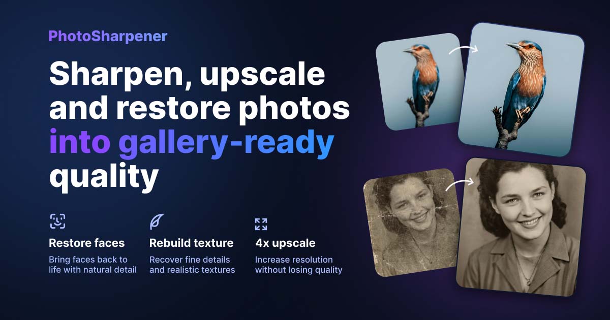
Print-ready Upscaling
How to upscale a small photo for a large poster naturally?
TL;DR
- Decide the poster size first, then use pixel math to see whether your source needs a 2x upscale, a 4x upscale, or a smaller final print.
- Clean up tone, borders, noise, and compression before you upscale so the AI does not exaggerate existing flaws.
- If you use
PhotoSharpener, keep the pass conservative and review faces, text edges, and high-contrast borders at full size before exporting.- A natural-looking poster usually comes from the least aggressive setting that solves the print problem, followed by one proof print.
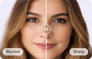
If you want a small photo to look good on a large poster, the real job is not "make it bigger." It is to add enough believable detail that the print still looks natural when someone stands in front of it. That usually means checking whether the source file is even close to the poster size you want, cleaning up obvious problems first, and then using AI upscaling with enough restraint that skin, fabric, and edges do not turn crunchy or fake.
Most bad poster enlargements fail for the same reason: the image is stretched before anyone does the print math. A file can look large on a laptop screen and still be far too small for paper. Once you know how many pixels the poster actually needs, the workflow gets much simpler. You can decide whether the source is strong enough, whether you need a 2x or 4x upscale, and whether a smaller poster will look better than a larger one forced beyond the image's limits.
Start with the print size, not the app
Screen size can be misleading
A photo that fills your monitor may still print tiny at good quality. Screens spread pixels across a backlit display, while printers pack them tightly onto paper. So the question is not whether the image looks big on screen. The question is how many pixels you have for every inch of the final poster.
That one shift in thinking prevents most disappointment. When people skip it, they often spend time testing sharpen filters, export settings, and random upscalers without noticing that the source file simply does not contain enough information for the print size they picked.
Use simple pixel math before you upscale
For close-viewed prints, 300 PPI is the safest target. For larger wall posters viewed from farther away, 180 to 240 PPI is often a realistic compromise. Very large decor pieces can still look good around 150 PPI, but only when the viewing distance is generous and the image does not contain fine text or critical detail. If you want the same math translated into standard print sizes for AI-enhanced files, this print-resolution guide is a useful companion.
Use this quick table to judge common poster targets:
| Poster size | Sharp target at 300 PPI | More forgiving target at 200 PPI |
|---|---|---|
| 12 x 18 in | 3600 x 5400 px | 2400 x 3600 px |
| 16 x 20 in | 4800 x 6000 px | 3200 x 4000 px |
| 18 x 24 in | 5400 x 7200 px | 3600 x 4800 px |
| 24 x 36 in | 7200 x 10800 px | 4800 x 7200 px |
If your photo is only 1600 pixels wide and you want a 24-inch-wide poster, you are not one click away from a perfect result. You are asking the tool to invent a lot of missing detail, so you need realistic expectations from the start.
![]()
Judge whether the source photo is worth enlarging
Find the best version before you edit anything
The strongest upscale usually starts with the strongest source. Use the original camera file, the highest-quality export, or the largest scan you can get. Avoid images pulled from social apps, chat threads, or screenshots if you have any better option, because compression damage becomes much more obvious once the image is enlarged.
If you are starting from a printed photo, make a fresh scan instead of photographing the print with a phone whenever possible. The Library of Congress notes in its digitization guidance that fragile photographs need careful handling during scanning, and that matters here because a clean, well-supported capture gives the upscaler far more usable information than a skewed phone shot with glare.
Check what is actually wrong with the image
Small size is only one problem. Many poster candidates are also soft, noisy, over-compressed, or slightly out of focus. Those issues affect how natural the final print will look, because AI upscaling tends to magnify them if you do not address them first.
Look at the file at 100% and ask three questions:
- Are the important areas still recognizable, especially faces and edges?
- Is the main problem low resolution, or is it blur and compression?
- Does the image still look believable when zoomed in, even if it looks weak?
If the answer to the third question is no, you may still improve the photo, but you should probably lower the final poster size instead of chasing a dramatic enlargement.
Clean the image before you ask AI to invent detail
Crop, straighten, and fix tone first
Upscalers work better when the input is already clean and intentional. Start with a duplicate of the file, then crop away empty borders, straighten the horizon if needed, and make gentle tone corrections so the subject is easy to read. If the image is flat, yellow, or muddy before enlargement, the larger version will just be a bigger flat, yellow, muddy file.
This is especially important for posters because small tonal problems become easier to notice at large size. A light contrast fix or white-balance correction often improves the final print more than extra sharpening does.
Remove the flaws that will get exaggerated
JPEG blocks, heavy grain, scanner dust, and halos around edges are all worth reducing before the upscale pass. You do not need to fully retouch the photo. You just want to stop the AI from mistaking damage for real structure.
The practical rule is simple: remove distractions that pull your eye away from the subject, but do not polish the image so much that it loses natural texture. Plastic skin and waxy skies do not suddenly look better because they are larger.
Choose an upscale approach that matches the photo
Pick the least aggressive setting that solves the print problem
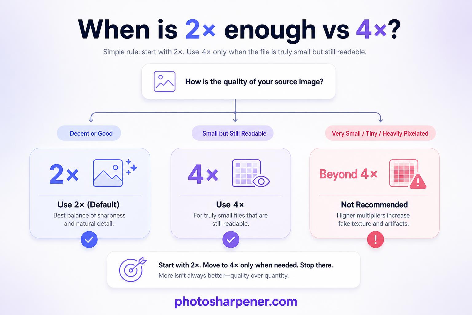
Most poster enlargements look best with a moderate upscale first. If the source is already fairly decent, 2x is often enough. If the file is truly small but still readable, 4x is usually the upper end of what looks natural for real photographs. Going beyond that can work for some images, but it also raises the risk of fake textures, repeated patterns, and overdrawn edges.
That is why a natural-looking poster usually comes from solving the minimum problem needed. If 2x gets you into a safe print range, do not force 4x just because the button exists.
Match the model to the image content
Competitor pages consistently separate portrait images from textured scenes and graphics, and that pattern makes sense in practice. Faces usually need gentler enhancement than brick walls, clothing texture, or landscapes. Text overlays and logos often need a model that preserves clean lines instead of generating extra texture. If the poster is really a family tribute or remembrance display, borrow the identity-first checks from this memorial print guide before you approve a stronger upscale.
Here is a simple selection rule you can follow:
| Image type | Best first choice |
|---|---|
| Portrait or family photo | Natural or face-aware model at conservative strength |
| Landscape, travel, or fabric texture | General photo or high-fidelity model |
| Screenshot, logo, or poster art with text | Clean-line or graphic-preserving model |
| Old scanned print | General photo model with light denoise before strong sharpening |
If the image overlaps with what PhotoSharpener is built for, a browser-based pass can be a practical option because it combines super-resolution, cleanup, and optional face restoration in one workflow. Keep the settings restrained, especially when the poster includes people. Natural usually beats dramatic once the file is on paper.
Run one careful upscale pass and review it properly
Preview at full size, not just fit-to-screen
The preview stage is where natural enlargements are saved or ruined. Always inspect the result at 100% or close to it. Look at the areas people notice first: eyes, hair, skin texture, text edges, and high-contrast borders. If those areas look believable up close, the poster usually holds together well at normal viewing distance.
If they look strange on screen, printing larger will not hide the problem. It will only make the fake detail easier to see.
Watch for the common signs of overprocessing
The most common failure signs are easy to spot once you know them:
- halos around dark edges
- stringy hair
- skin that looks airbrushed
- repeating textures in grass, brick, or fabric
- text that becomes warped instead of cleaner
A natural poster print should look cleaner than the original, not more "AI" than the original.
If you see those issues, reduce sharpening, reduce denoise, or step down to a lower upscale factor. In many cases, a milder version printed slightly smaller looks much better than the strongest version printed huge.
Prepare the final file for printing
Export in a format your printer can use cleanly
Once the upscale looks right, export a master file at the final dimensions. TIFF is ideal when you want the cleanest possible print file and your print shop accepts it. A highest-quality JPEG is usually fine for consumer print labs and easier to upload, but save it only at the end so you do not pile extra compression on top of the original damage.
Keep one untouched master of the upscaled result before you resize, crop for bleed, or convert formats for a lab portal. That gives you a safe version to return to if the printer asks for a different spec.
Proof before you commit to the full poster
This is one of the most useful habits from the ranking pages and one of the easiest to skip. Make a small proof print or a detailed crop first, especially if the image contains faces. An 8x10-inch crop of the most important area tells you much more than staring at the image on a bright monitor.
If the proof looks a little soft, you still have options: lower the poster size, switch to a matte paper that hides minor harshness, or use the less aggressive upscale version. If the proof already looks natural, the full poster is usually a safe bet.
A practical workflow that keeps the poster looking natural
Follow this order when you are doing it yourself
If you want the shortest reliable path, do this:
- decide the poster size first
- calculate the pixel target
- locate the best original file or scan
- crop, straighten, and lightly correct tone
- reduce obvious noise or compression damage
- run one moderate AI upscale pass
- inspect the result at full size
- export a print-ready master
- proof before ordering the final poster
That order matters because each step supports the next one. If you skip the early decisions, you end up using enhancement to compensate for planning problems instead of actual image problems.
Know when to print smaller instead of pushing harder
Sometimes the best way to keep a poster looking natural is to back off the size. This is especially true when the source file is tiny, heavily compressed, or slightly out of focus. AI can rebuild plausible detail, but it cannot guarantee that an extreme enlargement will still look honest at close range.
A successful result is not always the biggest poster possible. It is the poster that still looks believable on the wall. When you start with real print math, use the cleanest source you can find, and let the upscale stay conservative, even a small photo can become a poster that looks clear instead of obviously stretched.
FAQ
How much resolution do I need for a poster?
For a close-viewed poster, 300 PPI is the safest target. For a wall print viewed from farther away, 180 to 240 PPI can still look good, but you should decide that tradeoff before you upscale so you know how many pixels the file actually needs.
Is 4x always better than 2x for poster printing?
No. A 4x upscale asks the model to invent far more detail, which raises the risk of fake textures, halos, and waxy skin. If 2x gets the image into a safe print range, it is usually the more natural choice.
Should I sharpen before I upscale a small photo?
Usually no. Start by cleaning tone, borders, noise, and compression first. Heavy sharpening before the upscale often makes edges harsher and gives the AI worse material to enlarge naturally.
What should I check before I send the poster to print?
Review the upscaled file at full size and look closely at faces, text edges, and strong contrast lines. Then make a proof print or a detailed crop so you can catch halos, fake texture, or softness before ordering the full poster.
When should I print smaller instead of pushing the upscale harder?
Print smaller when the source file is tiny, heavily compressed, or slightly out of focus and the enlarged preview already looks synthetic. A believable smaller poster usually looks better on the wall than a larger one built on obvious guessed detail.