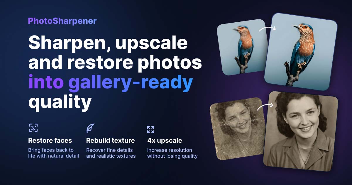
Print-ready Upscaling
Can I sharpen a blurry family photo for memorial print?
TL;DR
- Yes, a blurry family photo can often become good enough for memorial print if the face is still recognizable and you start from the best source you can get.
- Scan the original print if possible, clean and tone-correct the file first, and sharpen only after you know the final print size.
- Use one conservative AI pass, not repeated heavy enhancements; a tool like
PhotoSharpenercan help if you still reject any version that changes the person's expression or identity.- Match the print size to the real pixel count, then make one proof because a believable smaller print is better than a larger artificial-looking one.
If you are asking whether you can sharpen a blurry family photo for memorial print, the honest answer is yes, often enough to make a respectful, clear tribute. But the goal is not to turn a weak photo into a perfect studio portrait. The goal is to keep the person recognizable, improve clarity where the file still holds usable detail, and choose a print size that looks natural in the room.
That matters because memorial prints are emotional objects, not just technical files. People notice the face first. So the best workflow is calm and practical: get the strongest source, fix the obvious problems in the right order, use sharpening and upscaling with restraint, and proof the final result before the service.
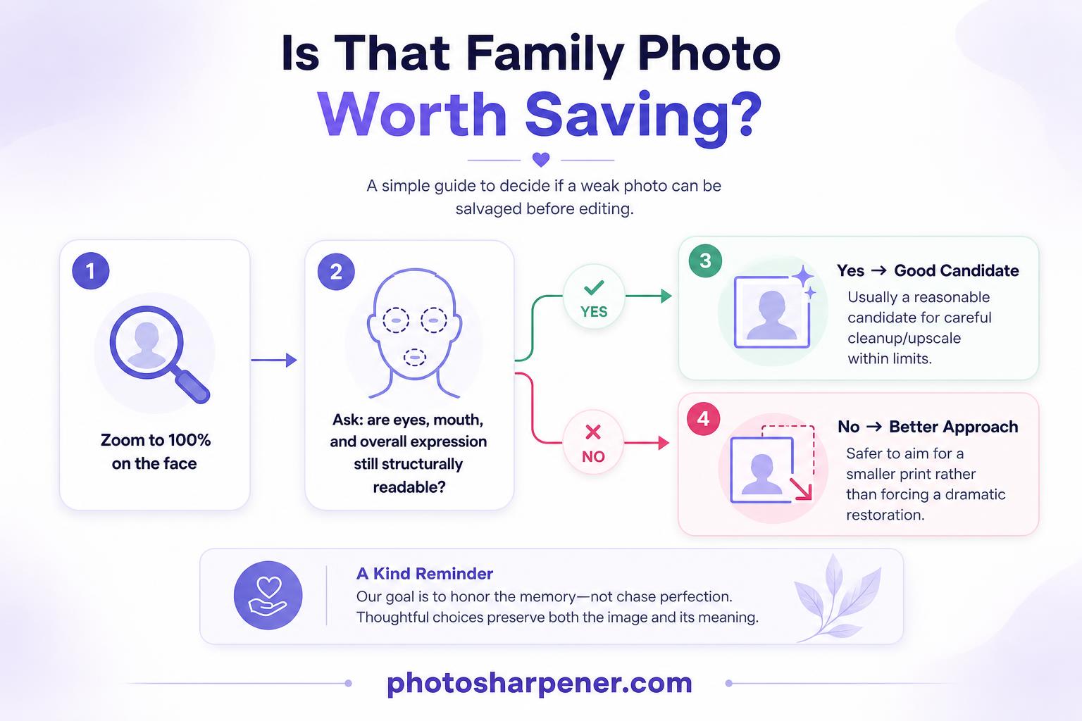
Decide whether the photo is salvageable for memorial print
Mild blur can improve, but severe blur has limits
Many family photos that look "too blurry" are actually a mix of small size, soft focus, old scanning, and compression. Those problems often respond well to better scanning, light cleanup, and a careful sharpening or upscale pass. Mild softness, scanner blur, and JPEG damage are much easier to improve than a photo that is badly out of focus or smeared by heavy motion blur.
The fastest reality check is simple: zoom in and ask whether you can still make out the eyes, mouth, and overall expression. If those features are present, even softly, the file is usually a good candidate. If the face is mostly a blob of tone with no clear structure, the safer goal is a smaller, cleaner print instead of a dramatic restoration.
Likeness matters more than maximum sharpness
For a memorial print, recognition is more important than aggressive detail. A version that looks sharper but subtly changes the eyes, teeth, smile, or age of the person is not actually better. It is just more processed.
A good decision rule is this: if family members would immediately say "yes, that looks like them," you are on the right track. If the sharpened version feels more polished but less true, back off. Memorial images should feel dignified and familiar, not synthetic.
Start with the best source you can get
Scan the original print if possible
If the physical photo still exists, scanning it is usually the best starting point. The Library of Congress notes in its scanning basics that 300 to 400 DPI is satisfactory for many snapshot prints and common enlargements. In real memorial-print workflows, 600 DPI is often worth using when the print is small, you may need to crop tighter, or you want more room for a modest upscale later.
Clean the scanner glass, gently dust the print, and disable aggressive auto-enhance settings. Save a master scan as TIFF or PNG if you can, then make edits on a duplicate. That one habit gives you a clean fallback if sharpening, color correction, or face recovery goes too far.
If the only copy is digital, hunt for the largest file
When the original print is missing, the next best improvement often comes from finding a better source before you edit anything. Ask relatives for the original scan, the full camera-roll file, or the version that was emailed before it was sent through chat apps.
Avoid screenshots, social-media downloads, and WhatsApp copies when any better file exists. A tiny compressed image can still become usable for a small memorial print, but it gives every sharpening tool less real information to work with.
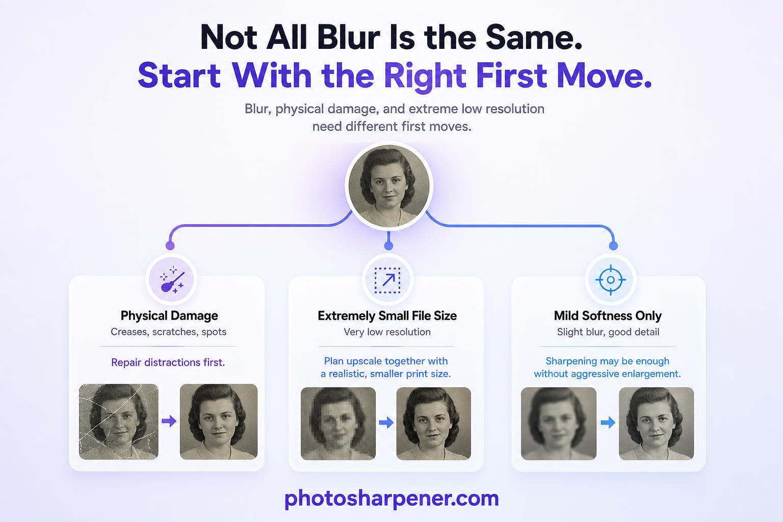
Diagnose the real problem before you sharpen
Blur, low resolution, and damage need different fixes
This is where people lose quality. They treat every weak photo as one generic "enhance it" problem, then stack random filters until the face looks fake. A soft scan needs a different first move than a cracked print, and a tiny file needs a different first move than a slightly blurry but well-exposed portrait.
Use this mental checklist before you edit:
- if the photo is physically damaged, repair the distractions first
- if the file is tiny, think about upscale and smaller print size together
- if the image is only mildly soft, sharpening may be enough without a strong enlargement
Once you know which issue dominates, the workflow gets easier and the result usually looks more natural.
Check the face first at 100% zoom
Open the photo at full size and look at the areas people will study first: eyes, mouth, hairline, and the outer shape of the head. If those areas still hold structure, the photo can often become presentable for a framed memorial display or service handout.
This check also tells you how ambitious to be. If the face is strong but the background is rough, focus on the portrait and let the background stay less perfect. If the face itself is fragile, plan for a smaller print and lighter processing from the start.
Clean and prep the image before any AI pass
Crop, straighten, and correct tone first
Work on a duplicate, not on the master. Crop away scanner borders, dead space, and anything that does not help the portrait. Straighten the image so the person sits naturally. Then make light tonal corrections so the face reads clearly before you add any new detail.
This step matters because sharpening magnifies what is already there. If the file is flat, yellow, dark, or crooked, the sharpened version will simply be a sharper flat, yellow, dark, or crooked file. A gentle contrast or levels adjustment often improves a memorial photo more than an aggressive sharpen slider.
Remove dust, creases, and distractions carefully
Clean up the defects that pull the eye away from the person, especially dust specks, scanner lint, small scratches, and obvious creases across the face or clothing. Those flaws get harder to ignore once the image is enlarged.
But keep the edits respectful. Remove damage, not history. Do not erase characteristic features, jewelry, or meaningful objects just because they look imperfect. A memorial print should look cared for, not rewritten.
Sharpen and upscale conservatively
Use the least aggressive setting that solves the print goal
Most memorial photos look best after one moderate pass, not repeated enhancement from three different apps. If a small upscale gets you to the print size you need, stop there. If 2x gets the file into a safe range, there is rarely a good reason to force 4x just because it exists. If you need the print math spelled out before you choose 2x or 4x, keep this print-resolution guide open while you decide.
If you want a browser-based option, PhotoSharpener can be practical because it combines super-resolution, cleanup, and optional face restoration in one pass. The important part is not the brand. It is choosing the most believable version instead of the sharpest-looking preview.
Watch for the common warning signs of overprocessing:
- halos around dark edges
- stringy hair
- waxy skin
- eyes that look redrawn
- text or clothing detail that looks thicker, not clearer
If you see those signs on screen, print will not hide them. It will usually make them more obvious.
Protect identity if you use face restoration
Face restoration can help when the portrait is soft but still recognizable. It can also change the person faster than any other setting. That is why comparison matters. Put the original next to the enhanced version and check the eyes, smile line, nose shape, and age cues.
Choose the version the family would recognize first, even if it is a little softer. For memorial print, "natural and true" beats "impressive but unfamiliar" every time.
Match the print size to the pixel count
Simple memorial print sizes and pixel targets
Close-viewed prints still benefit from 300 PPI, especially for service programs, tabletop frames, and hand-held keepsakes. A larger memorial board or display print can sometimes look good around 240 PPI because people usually stand farther away. What matters is matching the print size to the file you actually have.
Use this quick table as a reality check:
| Print size | 300 PPI target | 240 PPI target |
|---|---|---|
| 4 x 6 in | 1200 x 1800 px | 960 x 1440 px |
| 5 x 7 in | 1500 x 2100 px | 1200 x 1680 px |
| 8 x 10 in | 2400 x 3000 px | 1920 x 2400 px |
| 11 x 14 in | 3300 x 4200 px | 2640 x 3360 px |
The useful formula is straightforward: required pixels = print size in inches x target PPI. So if you want an 8 x 10 memorial print at 300 PPI, you need about 2400 x 3000 pixels. If your restored file does not get close to that, lower the print size before you push the sharpening harder.
![]()
Print smaller when the file still looks fragile
This is often the decision that saves the whole project. A believable 5 x 7 or 8 x 10 print usually looks better than a large portrait built on guessed detail. That is especially true when the only source was a chat download, a tiny crop, or a photo of a photo.
If the image is going into a funeral program, stay conservative because people hold those close. If it is a framed memorial display viewed from a few feet away, you may have a little more flexibility. Even then, natural still matters more than size. When the job starts to look more like enlarging a small file for a bigger wall board, the size-planning steps in this poster upscaling guide are a better fit than pushing memorial settings harder.
Proof the final file like a print, not a screen image
Export one clean master and avoid repeated resaves
Once the image looks right, export a final master at the exact dimensions you plan to print. TIFF is ideal when your print shop accepts it, while a highest-quality JPEG is usually fine for consumer labs and quick turnaround. The important part is saving once at the end instead of repeatedly opening and re-saving a compressed file.
If the photo is going into a memorial layout, insert the final exported image directly. Do not paste a screenshot, drag in a social-media preview, or keep making new JPEG copies as you test designs. That is how good edits turn soft again.
Matte paper and a quick proof can save the day
Paper choice changes what people notice. Matte paper often hides minor noise, slight softness, and small retouching marks better than glossy paper. Glossy stock can look beautiful with a strong file, but it also makes halos and artificial sharpening easier to see.
If time allows, make one proof. It can be a small test print or just a crop of the face at final size. Check the eyes first, then skin texture, then any repaired areas. That one proof catches the problems that matter in real life: faces that feel synthetic, prints that run too dark, and detail that looked fine on a monitor but falls apart on paper.
A simple workflow for families under time pressure
Quick checklist from scan to print
If you need the shortest reliable path, follow this order:
- find the best original file or make a fresh scan
- save an untouched master copy
- crop, straighten, and lightly fix tone
- remove the most distracting dust, scratches, or crease marks
- decide the print size you actually need
- sharpen or upscale just enough to hit that size
- compare the result with the original face
- export one clean final file
- make one proof before the full memorial print
That order works because each step solves the next problem cleanly. It keeps you from using AI as a substitute for good source handling and realistic print decisions.
When to stop and ask for manual help
Some photos need more than automated sharpening. If part of the face is missing, the print is heavily torn, or the only file is extremely tiny and badly blurred, AI may improve the image without making it truly safe for a larger memorial print. In those cases, print smaller or ask for manual restoration help.
That is not failure. It is good judgment. A respectful memorial image does not need to look brand new. It needs to feel clear, familiar, and honest enough that people immediately recognize the person being honored.
FAQ
Can sharpening really fix a blurry family photo for memorial print?
Often, yes. Mild blur, scanner softness, and low-resolution issues can improve a lot with better scanning, cleanup, and one careful sharpening or upscale pass. Severe out-of-focus blur usually cannot become truly sharp, so the safer solution is a smaller print.
What scan DPI should I use?
For many snapshot prints, 300 to 400 DPI is enough. Use 600 DPI when the original is small, you may crop tighter, or you need extra room for enlargement. Save a master scan as TIFF or PNG if possible.
What print size is safest if I'm unsure?
If you are uncertain, start with 5 x 7 or 8 x 10 instead of a larger memorial board. Smaller prints are more forgiving and usually preserve a natural look better when the source file is weak.
Should I use face restoration on a memorial photo?
Only if it keeps the person recognizable. Face restoration can help soft portraits, but it can also change identity cues fast. Always compare with the original and choose the version that feels most true to the person.
When should I ask for manual restoration help?
Ask for help when the face is partly missing, the damage is heavy, or the only file is so tiny that even a conservative upscale still looks artificial. Manual restoration or a smaller final print is often the better memorial choice in those cases.
Affiner · Agrandir · Restaurer
Détail réel reconstruit en ~8 s. Jusqu’à 4× d’agrandissement.