E-commerce Photo Quality
How can I improve e-commerce product photo quality?


TL;DR
- The biggest improvement usually comes from better light, steadier framing, and more consistent editing, not from buying a more expensive camera.
- For most stores, a strong image set means one clean hero shot, a few alternate angles, at least one close-up, and one scale or in-use image when it helps.
- Fix white balance, exposure, dust, and glare before you worry about fancy retouching.
- If a photo is already well lit but slightly soft or too small, PhotoSharpener can help sharpen and upscale it. If the lighting or reflections are bad, a reshoot is usually faster.
- Review every image both as a tiny thumbnail and at full zoom, because shoppers judge both.
If you want to improve e-commerce product photo quality, it helps to stop treating it like one problem.
Sometimes the real issue is flat lighting. Sometimes it is glare on packaging, fuzzy edges from handheld shooting, weak color accuracy, or a product image that is simply too small for zoom. And sometimes the photo itself is fine, but the whole catalog feels cheap because every SKU is framed and edited differently.
That is why the best improvements usually come from a simple system: cleaner inputs, more consistent capture, lighter editing, and export settings that fit the store. If you do that well, your product photos look sharper, more trustworthy, and easier to buy from.
What actually improves e-commerce product photo quality
The biggest quality gains usually come from control, not gear
Top-ranking product photography guides keep returning to the same point: shoppers care about clarity, consistency, and honesty more than they care about whether you used a DSLR or a phone.
That is good news for smaller stores, because it means you do not need to rebuild everything around expensive equipment. In most cases, quality improves fastest when you control these four variables:
- Light so the product looks clean and true to life
- Stability so details stay sharp
- Consistency so your catalog feels like one store, not ten
- Editing restraint so the product still looks real when it arrives
If you improve only one image, you may get a nicer photo. If you improve those four variables, you usually get a better product page and a better catalog.
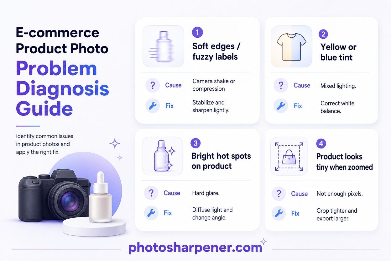
Diagnose whether the problem is blur, color, glare, or image size
Before you reshoot or re-edit anything, name the real problem. "Bad product photo quality" is too vague to fix well.
| If the image looks like this... | The real problem is usually... | Best first move |
|---|---|---|
| Soft edges, weak detail, slightly fuzzy labels | camera shake, missed focus, or too much compression | stabilize the shot, refocus, then use light sharpening |
| Yellow, blue, or inconsistent whites | mixed light or drifting white balance | use one light source and correct white balance first |
| Bright hot spots or mirror-like reflections | hard light or poor light placement | diffuse the light and change angle before editing |
| Product looks tiny or weak when zoomed | not enough pixels or too much empty background | crop better and export a larger clean source |
| Every SKU looks different side by side | no shot standard or edit standard | lock one framing, background, and edit workflow |
This matters because the wrong fix can make the image worse. Sharpening will not fix bad glare. Upscaling will not fix yellow lighting. And heavy retouching will not rescue a gallery that feels inconsistent from product to product.
Fix the capture setup before you edit anything
Use soft repeatable light and a cleaner background
If your photos start out harsh, dim, or color-shifted, editing becomes cleanup work instead of improvement.
The safest setup for most products is still the one that dominates the current SERP:
- one soft light source
- a clean white or neutral background for the main product image
- a reflector or white foam board to lift the shadow side
- enough space around the product so you can crop for different channels later
Indirect window light works well for many categories, especially matte packaging, home goods, candles, apparel flat lays, and simple accessories. But it only works if you can repeat it. If your window setup changes every hour or every weather shift, your catalog starts drifting.
That is why simple continuous lights or a softbox setup often beat "free" daylight once you are adding products regularly. The goal is not studio drama. The goal is predictable light that makes colors look stable and surfaces look believable.
For your hero image, keep the background simple. If you sell on marketplaces as well as your own site, it is smart to check the platform's live image rules. For example, the Amazon style guide still expects a pure white main image for many listings, along with accurate color and a product that fills most of the frame.
Stabilize the camera and lock a few simple settings
Many product images look "cheap" for a boring reason: they were shot quickly, handheld, and slightly differently every time.
A tripod fixes more than sharpness. It also fixes repeatability.
With a stable camera or phone mount, you can keep:
- the same distance from the product
- the same camera height
- the same hero angle
- the same crop ratio
That makes a huge difference when shoppers move between SKUs.
If you shoot with a phone, keep the workflow simple:
- use the rear camera
- clean the lens
- avoid digital zoom
- tap to focus on the product
- lower exposure slightly if highlights are blowing out
- use a timer or remote trigger so you do not shake the shot
If you shoot with a dedicated camera, keep ISO low, use a moderate aperture that keeps the whole product sharp, and avoid changing white balance from shot to shot. The exact settings matter less than the habit of not letting the camera guess differently every time.
Shoot the image set shoppers need to trust the product
Keep one hero style and consistent framing across the catalog
A lot of stores focus on making one product look great. Stronger stores make the whole gallery feel reliable.
Start by defining one hero-image standard:
- same background treatment
- same crop style
- similar product scale in frame
- similar angle for products in the same category
This is where many stores quietly lose quality. Not because each image is terrible, but because one product is cropped tight, one is far away, one is warm, and another is cool. The result feels less professional even when the products themselves are good.
Use a reference image and compare every new hero shot against it before moving on. That one habit saves a lot of rework later.
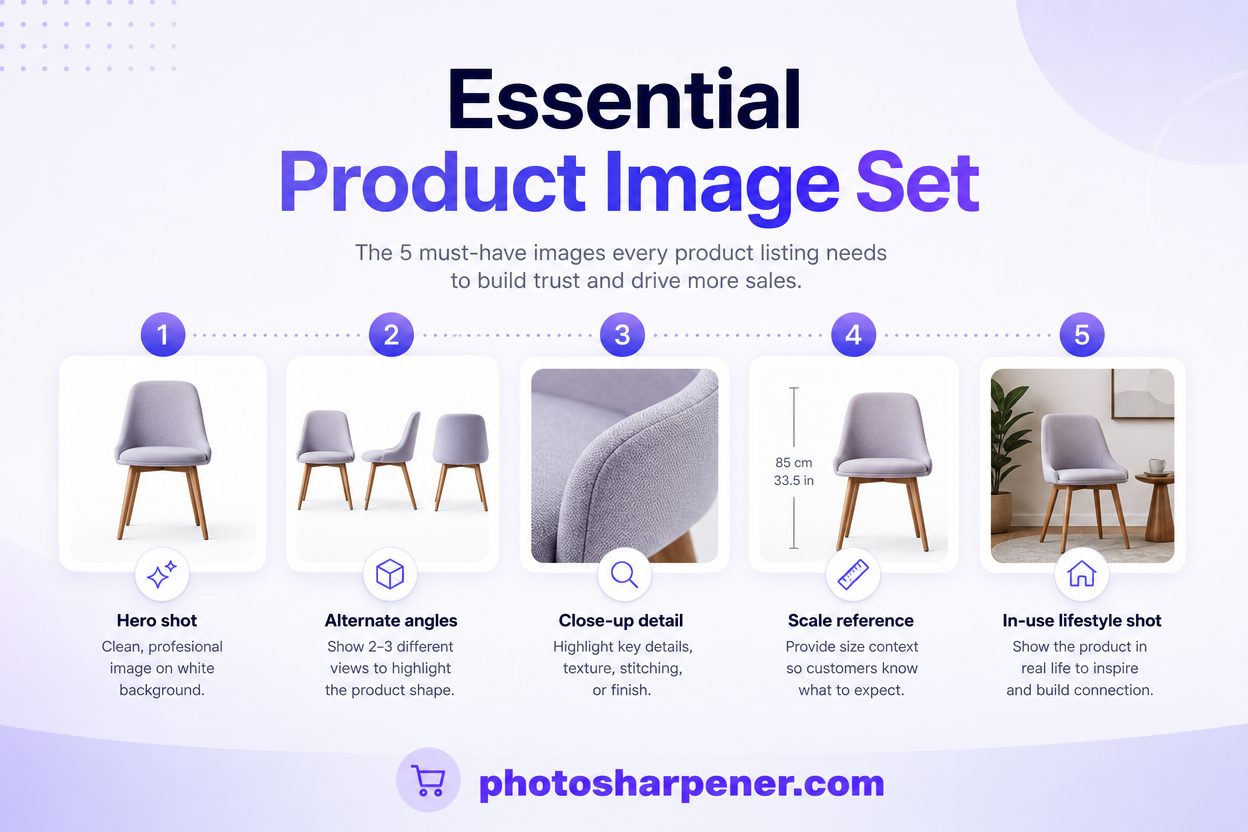
Add detail, scale, and in-use photos that answer buying questions
High-quality e-commerce photography is not just about the hero image. It is also about whether the rest of the gallery removes doubt.
For most listings, a useful image set includes:
- a clean hero image
- two to three alternate angles
- one close-up that proves material or finish
- one scale image if size could be misunderstood
- one in-use or context image when it helps the shopper imagine the product
This matches what the best competitor guides keep emphasizing. Product photos work when they answer the questions a shopper would normally solve in a store:
- How big is it really?
- What does the texture look like?
- Is the finish glossy, matte, thick, soft, or structured?
- What exactly comes in the box?
If your product has text, stitching, engraving, labels, or important surface detail, zoom in on that intentionally. A close-up is often what turns a "nice photo" into a confidence-building one.
Edit for accuracy, not drama
Correct white balance, exposure, and distractions first
Editing should make the product look clearer and more truthful, not more processed.
Start with the boring fixes:
- white balance
- exposure
- crop and straightening
- dust, lint, fingerprints, and small distractions
- background cleanup if needed
Color accuracy matters more than many stores realize. If the photo looks richer than the real item, the image may win the click and lose the return. That is especially risky in apparel, beauty, home decor, and any category where shoppers care about tone, finish, or material.
So when you edit, ask one simple question: Does this look better because it is clearer, or just because it is more dramatic?
If the answer is "more dramatic," back off.
Sharpen and denoise gently so the product still looks real
Subtle sharpening can absolutely help product images. So can moderate noise cleanup. But both are easy to overdo.
Over-sharpened product photos usually show the same warning signs:
- bright halos on edges
- crunchy labels or stitching
- fake-looking texture
- glossy surfaces that look brittle
Over-denoised photos tend to lose fine texture and start looking plasticky. That is the opposite of what most shoppers need, because they are often zooming in to judge material quality.
Use this order when the image only needs refinement:
- fix color and exposure
- clean obvious distractions
- apply light sharpening
- denoise only if the file still looks dirty
- stop as soon as the image looks natural
If your current problem is more about weak files than manual editing skill, our no-Photoshop guide is a good companion because it breaks down when to use a browser tool and when to use a full editor.
Make sure the final files stay sharp on your store
Export enough pixels for zoom and channel reuse
Sometimes the shoot was fine and the export ruined it.
For most stores, you want enough pixels for:
- clean product-page display
- useful zoom
- mobile crops
- ads, email, and social reuse without immediate degradation
This does not mean "export the biggest file possible." It means exporting a sharp source that suits the storefront and the way customers actually inspect the product.
If shoppers zoom into material, labels, stitching, or product details, the source file needs to hold up there. A tiny image with lots of empty background wastes the available pixels on the wrong area. Crop with intent so the product fills the frame sensibly without feeling cramped.
If you already have a decent shot but it is too small for the way you need to use it, our resolution guide and upscaling tools will help you choose whether simple upscaling is enough or a different workflow makes more sense.
Keep file size, filenames, and alt text working for the page
A product photo is not "high quality" if it looks good but slows the page badly or arrives with messy metadata.
After editing:
- compress the delivery version so the page stays fast
- keep the aspect ratio consistent across similar products
- use descriptive file names instead of camera gibberish
- write alt text that describes the actual image and product
That is not just housekeeping. Google image SEO still emphasizes sharp images, descriptive alt text, and relevant page context, so image quality is partly about discoverability too, not only appearance.
For marketplaces and category grids, also test the image as a small thumbnail. Many product photos look good in isolation and weak in the exact place where shoppers first see them.
Use AI when the original is decent but not quite good enough
When AI sharpening and upscaling are worth using
AI tools are most useful when the original photo is already decent and just needs help crossing the line into "store-ready."
That usually means:
- the product is in focus but a little soft
- the file is slightly compressed
- the source is a bit too small for zoom or crop reuse
- edges and textures need a modest lift, not a total reinvention
In those cases, PhotoSharpener can be a practical option because it combines AI sharpening, upscaling up to 4x, and cleanup in one browser workflow. For e-commerce teams, that is most useful when you already have a good-enough shot and want to recover clarity without rebuilding the whole listing.
The key is moderation. If the product starts looking invented instead of improved, the tool has gone too far.
When a reshoot is still the faster and safer fix
AI is not the best answer when the source image is fundamentally wrong.
Reshoot instead if the photo has:
- harsh glare across the product
- incorrect color from mixed lighting
- bad reflections on glass or metal
- obvious perspective distortion
- missed focus on the most important detail
- deep shadow hiding part of the item
Those are capture problems first. Enhancement can polish them a little, but it cannot reliably make them trustworthy.
A useful rule is this: if the customer would complain that the product looks different in person, reshoot. If the customer would never notice the difference but the image feels a little weak on screen, enhancement might be enough.
Build a simple quality-control checklist for every SKU
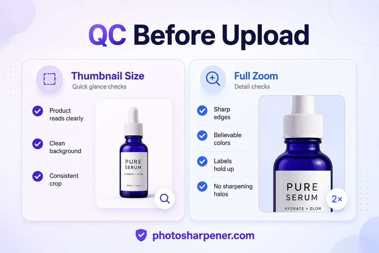
Check the image at thumbnail size and at full zoom
Shoppers do not inspect product photos at one size. They see them in grids, search pages, mobile thumbnails, and zoom views.
So before you upload, review every final image in two ways:
At thumbnail size
- does the product read clearly right away?
- is the background clean?
- does the crop match the rest of the catalog?
At full size or zoom view
- are edges still sharp?
- do colors still look believable?
- do labels, texture, or stitching hold up?
- did sharpening create halos or fake detail?
This is one of the simplest ways to catch the "looks fine until you zoom in" problem that hurts trust on product pages.
Write down a catalog standard so future shoots match
If you want better product photo quality long term, document your standard instead of relying on memory.
Keep a simple note with:
- hero angle by product category
- camera height and distance
- background choice
- lighting position
- image order for the gallery
- editing rules for white balance, crop, and sharpness
That turns quality from a one-time effort into a repeatable workflow.
You do not need a giant brand manual. A one-page checklist is enough for many stores. But without one, every new shoot becomes a fresh interpretation, and that is how a catalog slowly gets uneven again.
FAQ
Can I improve e-commerce product photo quality with just my phone?
Yes, in many cases you can. A modern phone is often good enough if you control lighting, stabilize the shot, use the rear camera, and keep your framing and edits consistent. The biggest failures usually come from bad light and inconsistent process, not from the phone itself.
Should my main product image always be on a white background?
Not always for every channel, but it is usually the safest default for the main listing image. White or very clean neutral backgrounds make the product easier to compare, work well in grids, and often align better with marketplace requirements. Lifestyle and context images can then support the rest of the gallery.
How many product photos should each listing have?
For many stores, five to seven useful images is a strong baseline: one hero image, a few alternate angles, one detail shot, one scale or in-use image, and anything else needed to answer obvious buying questions. The right number depends on how much visual explanation the product needs.
When should I reshoot instead of using AI enhancement?
Reshoot when the source image has the wrong lighting, strong glare, obvious reflections, warped perspective, or missed focus on the key detail. AI enhancement is more useful when the photo is already basically good and only needs a modest clarity or size boost.
Affiner · Agrandir · Restaurer
Détail réel reconstruit en ~8 s. Jusqu’à 4× d’agrandissement.